


Un Voyage dans les Vignes
〰️
Brand design & label illustrations
"Un Voyage dans les Vignes" is an organic wine producer. Their name means "A journey through the vines" and invte us to discover the finest grapes varieties of the Loire Valley.
To create consistency across all the brand's media, a hot-air balloon was designed to travel from wine to wine on the label illustrations.


Un Voyage dans les Vignes is a bold brand that wants to break free from the conventional norms of wine industry with a vibrant identity. The deep blue color recalls the abundant water in the Loire region, while the sunny yellow is like the warmth that ensures the growth of quality grapes. Mixing serif and sans serif typefaces, the logo bridges the gap between modernity and the more classic conventions of the wine market.
The cursive strokes of the "V" symbolize vine tendrils and craftsmanship, representing the manual labor involved. A hot-air balloon flying over a vineyard escapes from the logo, evoking freedom and travel. Several versions of the logo were designed to be adaptable to all the brand's media, including stationery, website and packaging. The two main colors were carefully selected to coexist seamlessly with the green of the Organic Agriculture charter, ensuring readability.

The website takes up the colors of the visual identity and retraces the history of the brand while presenting its catalog. I designed the website, supported by my talented friends Yan Degive and Emilie Nérot, respectively in charge of development and SEO copywriting.
This is a simple showcase site, which will evolve into a multilingual e-commerce site in the years to come, as Un Voyage dans les Vignes exports its production internationally.


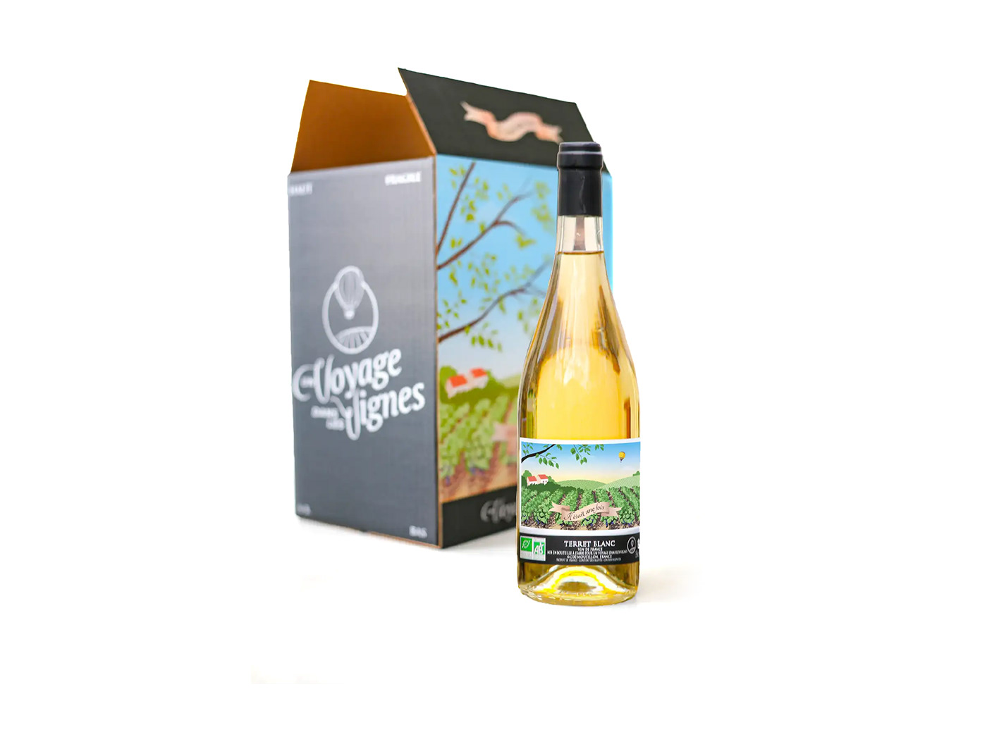
For the first years of operation, I created a versatile design for storage boxes (6 or 12 bottles) and bag-in-box packaging. A vineyard landscape encircles the box, creating a "puzzle" storage solution by extending the pattern from one box to another.
The illustration comes in the three brand colors, creating a series of three boxes to match the different wine productions. The winery team can then label each wine on the designated side of the box. The corks on each bottle also proudly bear the brand name!


I designed the first five labels for the wines produced and/or marketed by Un Voyage dans les Vignes. Different artists will illustrate future bottles to avoid creating a repetitive effect that could negatively impact sales. The hot air balloon remains the consistent element, traveling on each label to maintain brand coherence.
For this initial series, the idea was to inspire a sense of travel by representing the landscapes of each grape variety. Colorful, family-friendly illustrations were chosen for the affordable wines, while a sepia-toned illustration was used for a slightly higher-end wine.

Depending on production volume, the illustrations can also be applied to storage boxes.
The series concludes with a slightly offbeat illustration concludes the series featuring Laurent, a friend of the winemakers. His bold personality resonated so well with the taste of one of the wines that it was given his nickname, "Lolo le Kosto". In fact, this bottle is the most popular with customers in the store!

This complete visual identity creation has allowed "A Journey Through the Vines" to launch its initial productions, with very encouraging feedback from trade shows.
Get in touch 👉 marionpointcomm@gmail.com


